
The Product I designed a dynamic visual system for Brandon Marshall's I AM ATHLETE YouTube channel, focused on enhancing the long-form viewing experience. Tailored to an audience of sports fans, culture enthusiasts, and podcast-style viewers, the product delivers an immersive layout that reflects the raw, unfiltered energy of the I AM ATHLETE brand. The system includes versatile split screen variations optimized for multi-speaker conversations—allowing viewers to follow discussions more clearly and stay engaged throughout each episode. It also supports the post-production team by streamlining editing workflows and ensuring a consistent, polished visual language across the channel’s growing content library.
Project Duration August 2024 - February 2025
The Problem Viewer analytics revealed a consistent drop-off in engagement during longer episodes - especially in moments when multiple speakers were talking or when the visuals didn’t clearly highlight the current speaker. This led to viewer fatigue and reduced completion rates. The post-production team also lacked a flexible visual system that could keep up with the natural flow of the unscripted content.
The Goal primarily was to increase viewer retention by making conversations easier to follow and more visually engaging—without compromising the raw, conversational tone of the brand. A secondary goal was to support the post-production team with reusable visual assets that streamlined editing workflows and elevated the quality of content at scale.
Role and Responsibilities As the UX Brand Designer, I collaborated with the post-production team to improve the visual experience of long-form video content on the I AM ATHLETE YouTube channel. My core responsibilities included designing split screen variations that maintained audience engagement, aligned with brand aesthetics, and made multi-speaker conversations visually digestible.
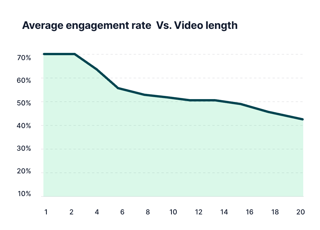
User Research Summary To better understand viewer behavior and identify pain points, I conducted informal qualitative research using a combination of YouTube Analytics, social media feedback, and collaboration with the post-production and audience engagement teams. Retention graphs and drop-off data from YouTube Studio Analytics revealed that viewer engagement consistently declined during longer conversation segments—particularly when multiple speakers were on screen and the layout didn’t clearly indicate who was talking. Social media comments echoed this frustration, with viewers noting moments of visual confusion or disengagement. Input from video editors further highlighted the need for a more structured, flexible visual system that could support the natural rhythm of unscripted, multi-speaker conversations.
User Pain Points
1. Speaker Confusion
Pain Point: Viewers struggled to follow who was speaking during fast-paced group conversations.
Design Solution: Created dynamic split screen layouts that prioritized active speakers and visually guided the viewer through the conversation flow.
Pain Point: Viewers struggled to follow who was speaking during fast-paced group conversations.
Design Solution: Created dynamic split screen layouts that prioritized active speakers and visually guided the viewer through the conversation flow.
2. Visual Repetition
Pain Point: Long-form episodes felt visually repetitive, leading to viewer fatigue and drop-off.
Design Solution: Introduced multiple layout variations to add visual rhythm and maintain engagement throughout extended content.
Pain Point: Long-form episodes felt visually repetitive, leading to viewer fatigue and drop-off.
Design Solution: Introduced multiple layout variations to add visual rhythm and maintain engagement throughout extended content.
3. Missed Reactions
Pain Point: Key emotional reactions and non-verbal cues were often missed in traditional single-camera cuts.
Design Solution: Designed multi-speaker framing that captured both the speaker and real-time reactions to preserve emotional depth.
Pain Point: Key emotional reactions and non-verbal cues were often missed in traditional single-camera cuts.
Design Solution: Designed multi-speaker framing that captured both the speaker and real-time reactions to preserve emotional depth.
4. Inefficient Editing Workflow
Pain Point: Post-production lacked a streamlined system for consistent visual formatting.
Design Solution: Delivered a reusable visual framework that allowed editors to plug in content quickly while maintaining a polished, on-brand look.
Pain Point: Post-production lacked a streamlined system for consistent visual formatting.
Design Solution: Delivered a reusable visual framework that allowed editors to plug in content quickly while maintaining a polished, on-brand look.
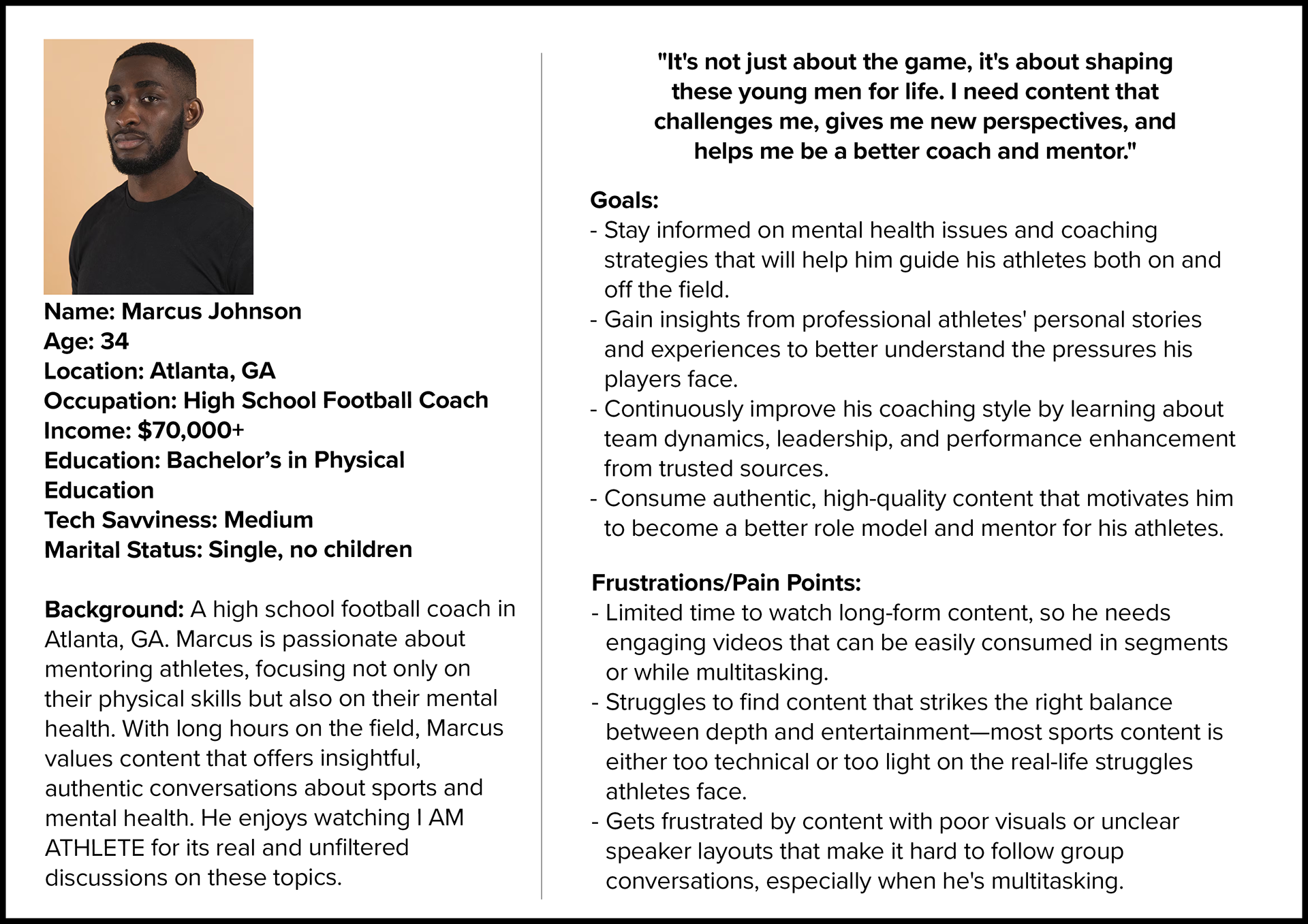
User Persona
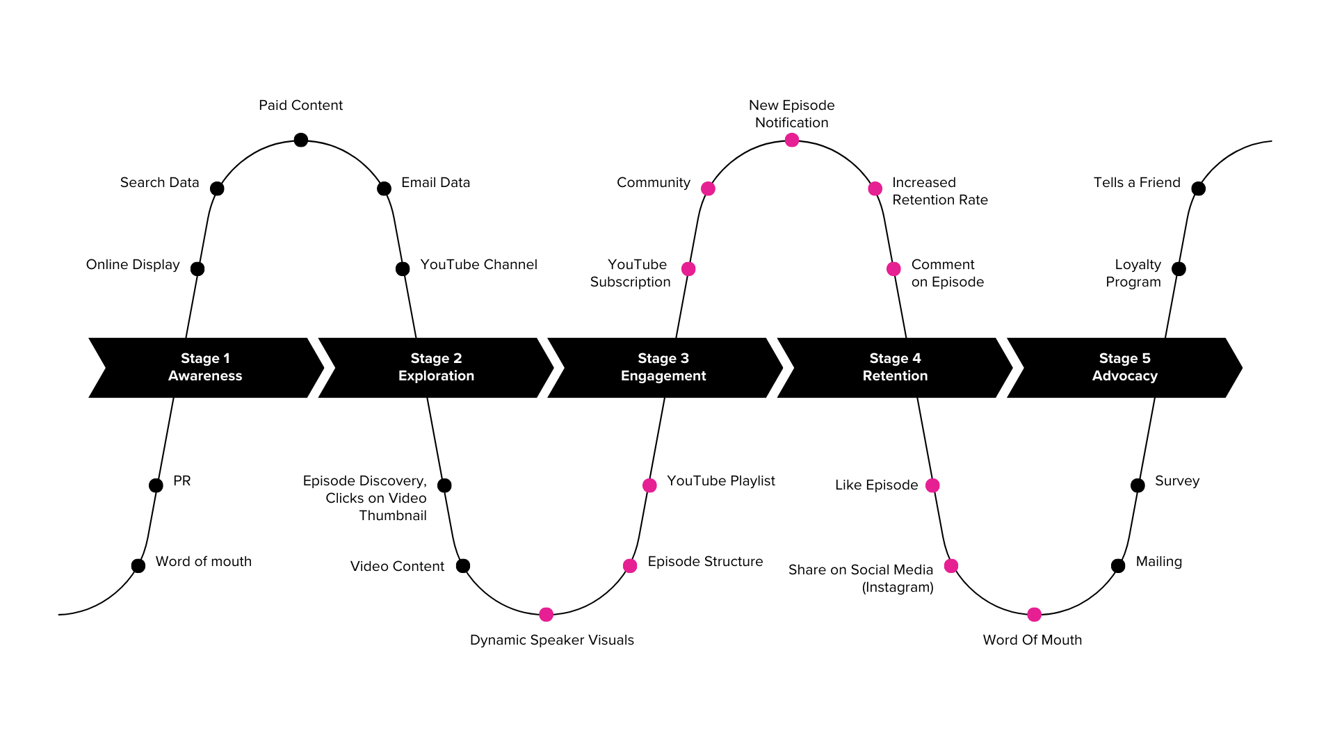
User Journey Map
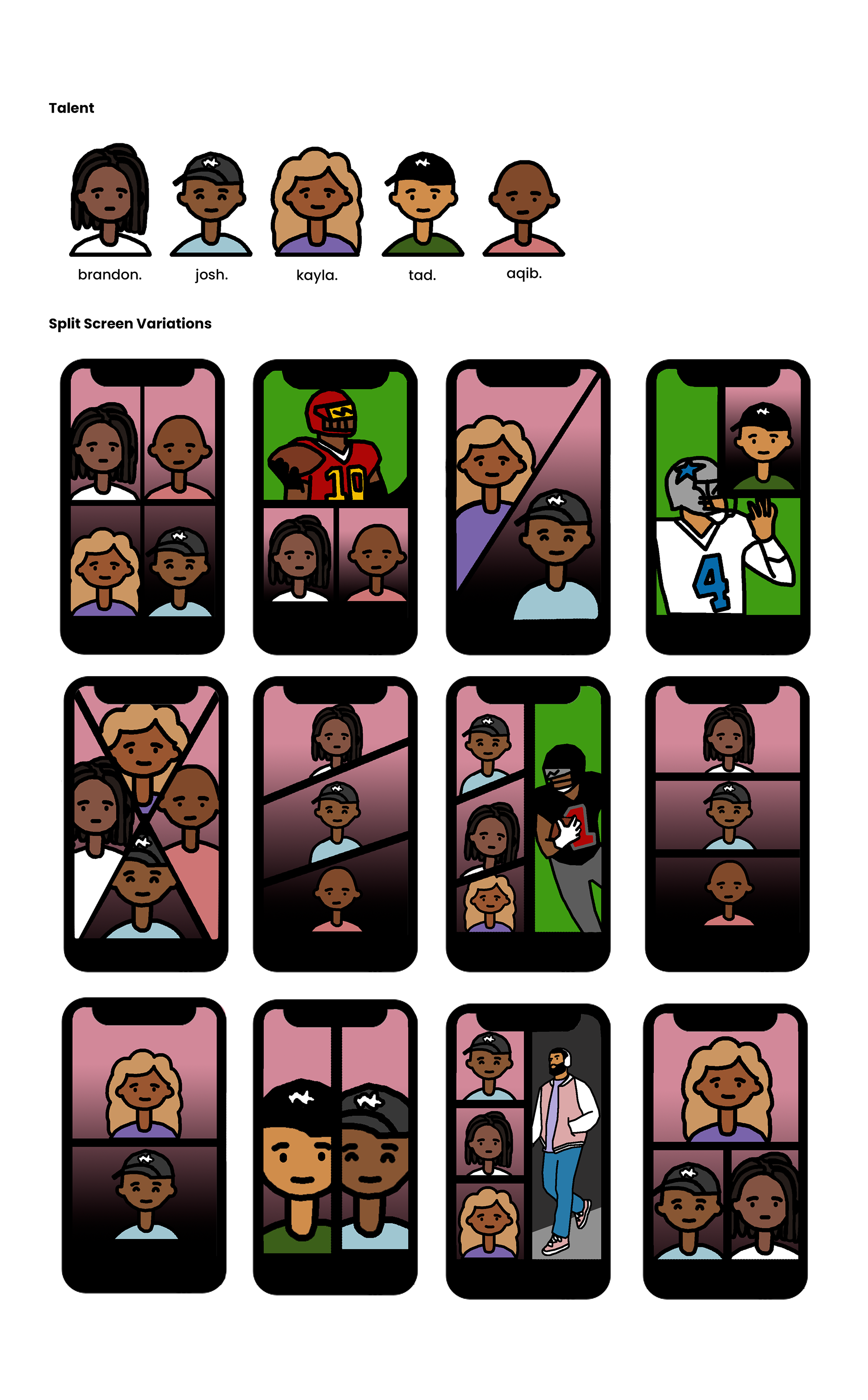
Split Screen Variations I designed a system of split screen templates tailored for multi-speaker conversations. These included:
- Dual and triple speaker layouts based on who was speaking
- Priority framing for emotionally impactful reactions
- Animated transitions between layout shifts for smoother pacing
- Clear speaker framing to match dialogue cues
This solution helped ensure that the energy of the conversation was matched visually—keeping viewers focused and immersed.
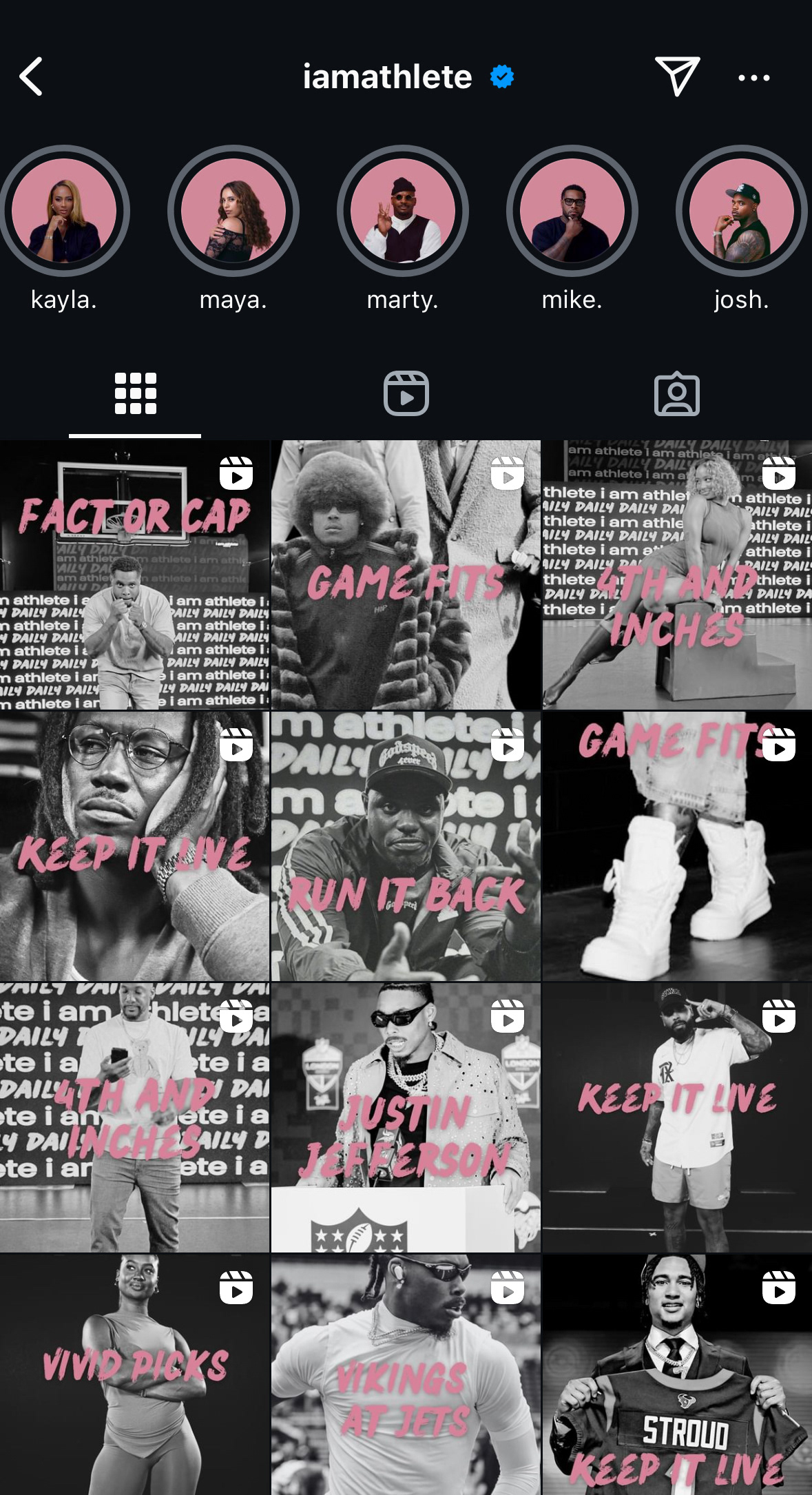
Live Product https://www.youtube.com/@IAMATHLETE
Results
- 15-20% decrease in mid-episode drop-off rates (measured via YouTube Studio retention analytics)
- Higher average watch times, especially on 30-60 minute episodes
- Positive feedback from editors citing faster post-production workflows due to the organized visual system
- Viewers commented on the improved clarity and flow of panel-style conversations
Feedback
The post-production team found the split screen templates to be highly adaptable and effective across various episode formats, streamlining the editing process while maintaining consistency. Viewers also provided positive feedback, appreciating the visual clarity the new system provided. They mentioned that the conversations felt easier to follow, particularly in episodes with multiple speakers, leading to a more engaging and immersive viewing experience.
Next Steps
- Brand Consistency Across Social Media: Focus on ensuring visual consistency across all social platforms, including Instagram, by adapting the split screen layout into shareable assets and stories.
- Motion Graphics & Overlays: Introduce motion graphics for real-time speaker identification to enhance engagement on social media snippets and clips.
- Further Testing: Continue testing new layout variations and receive feedback from both viewers and the post-production team to refine the design system.